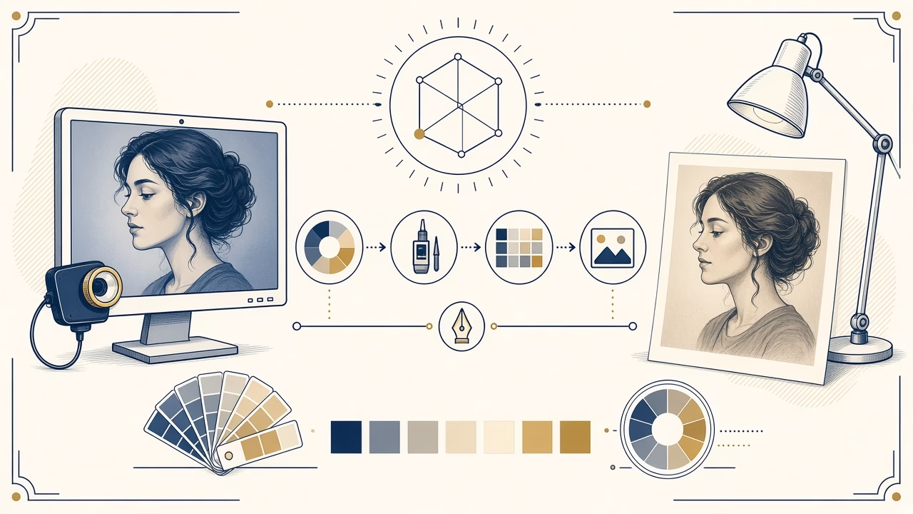
The same photograph can look luminous on a phone and quieter on paper without either version being defective. A display and a print are not identical windows onto a file; they are different reproduction systems. A useful comparison starts by considering what illuminates the picture, how bright the viewing environment is and which colour description accompanies the file through each stage.
Emitted light and reflected light
A screen emits light directly toward your eyes. It can present very bright whites and vivid colour, particularly when its brightness is near maximum. Paper produces no light of its own; it reflects illumination in the room. Its apparent white depends on the paper surface and light source, while even its deepest black reflects some energy. A print beside a brilliant display in a dim room is therefore an unfair comparison.
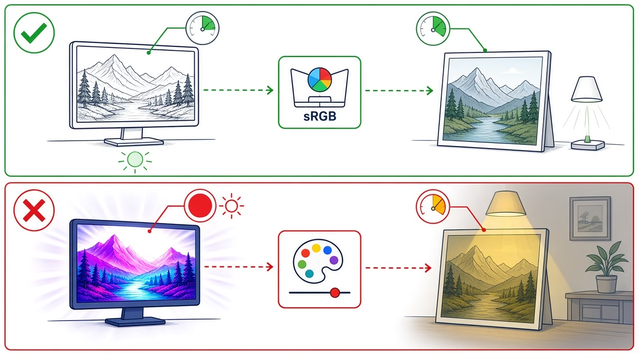
Before editing the image, lower an excessively bright monitor and view the print under stable, reasonably neutral light. Avoid direct sun, strongly coloured lamps and reflections across the surface. Give your eyes time to adapt because colour perception responds to the surroundings. A dark border, a warm wall and a cool white screen can each influence judgement even though the file has not changed.
Calibration, white point and workspace
Calibration adjusts a display toward known targets, while profiling describes how it actually reproduces colour. A measuring instrument is preferable because visual adjustment is affected by room light and adaptation. White point describes the chromatic appearance of white; luminance describes the display’s light output. There is no universal magic target for every room. The chosen conditions should relate sensibly to where physical prints will be assessed.
A calm, neutral workspace and consistent lamps are more helpful than colourful walls or daylight that changes throughout the session. Calibration does not make paper glow like a monitor. It creates a more dependable reference and reduces the temptation to compensate randomly for one device.
sRGB, gamut and ICC profiles
sRGB is a widely used colour space for consumer devices, web delivery and straightforward print workflows. Embedding its profile lets colour-managed applications interpret RGB numbers as intended. If a profile is missing or ignored, the same numerical triplet may be displayed differently. The W3C technical information for sRGB documents the standard space. Software implementations and export controls can change, so verify current application settings rather than relying on an old tutorial.
Gamut means the set of colours a device or a printer, ink and paper combination can reproduce. Some highly saturated display colours fall outside a print gamut and must be mapped to reproducible values. An ICC profile characterises behaviour so a colour-management system can perform that translation more predictably. It does not automatically beautify an image, and an output profile must correspond to the real production process to be meaningful.
Soft proofing and laboratory corrections
A soft proof uses an output profile to simulate a particular result on screen. Adobe’s official guidance notes that reliability depends on the monitor, monitor and output profiles, and ambient lighting. The preview can reveal out-of-gamut areas and approximate paper colour, yet it remains a simulation on a light-emitting device. It cannot replace a physical proof when matching is critical.
Ask the laboratory whether its normal workflow applies automatic colour or density correction. Such correction may help an untouched everyday phone image. If you have already adjusted a file in a controlled workflow, another automatic intervention can move it away from your intention. Agree on a no-correction option where appropriate, and use a laboratory profile only when that lab supplies it for the exact service or material.
Why a test print matters
For an album, exhibition or large print, a small proof often answers more questions than repeated screen edits. Include representative skin, neutrals, deep shadows, saturated objects and smooth gradients. Examine it under the light in which the final piece will be displayed, record specific changes and save a separate print version. Do not raise global saturation and exposure merely because one phone uses a more dramatic display mode.
Paper choice also changes visual character. Gloss can deepen apparent contrast but shows reflections; matte surfaces diffuse those reflections and may look gentler. This does not make one universally superior. Select material according to handling, framing, viewing light and the content of the picture, then approve the combination rather than colour-correcting in isolation.
Frequently asked questions
Why does my print look darker?
The display may emit far more light than the paper reflects, or the print may be viewed under illumination that is too weak for comparison.
Is lowering screen brightness enough?
It is a valuable first step, but dependable judgement also needs consistent room light, correct profiles and preferably a measured display calibration.
What is sRGB?
It is a standard RGB colour space used widely across consumer workflows and a practical delivery choice when the laboratory specifically requests sRGB files.
What does gamut mean?
Gamut is the range of colours a device or process can reproduce; monitors, papers and printing systems each have different boundaries.
Should I convert the image to CMYK?
Not unless the provider instructs you to do so. Many photographic labs accept RGB and handle conversion for their own output system.
What does an ICC profile do?
It characterises the colour behaviour of a device or space so compatible software can translate colour values with greater predictability.
Is soft proofing perfectly accurate?
No. It is an informative preview limited by display calibration, profile quality, monitor gamut, room conditions and the physical properties of paper.
Should I allow automatic lab correction?
It can help unedited casual photographs. For carefully prepared files, discuss disabling it to avoid an additional change after your own adjustments.
Why does colour shift under another lamp?
Paper reflects the spectrum of its illumination, so warm, cool or poor-quality light sources can produce a visibly different colour impression.
When is a test print worthwhile?
Whenever size, material or colour accuracy carries meaningful cost, a representative proof reduces guesswork before committing to final production.
Application controls, printer drivers and platform behaviour evolve; always check current software documentation and the laboratory’s latest delivery guidance.
Follow us



Print online with our application
Send print-ready photographs with confidence
Upload your images through Foto Panorama Online Print, or contact the lab when you need colour guidance and a physical proof.