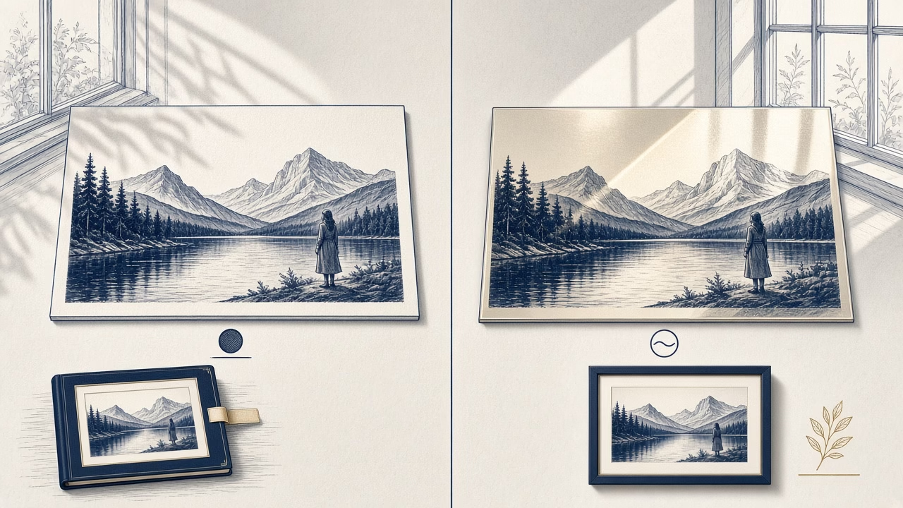
There is no single winner between matte and glossy photo paper for every image. Surface finish changes how light is reflected, how readily fingerprints appear and how we perceive contrast or saturation. It cannot repair low resolution, incorrect colour or a poor source photograph. Choose according to subject matter, display position, handling and the actual production options currently offered by the lab.
How glossy paper behaves
A smooth glossy surface usually delivers deeper perceived contrast, clean-looking blacks and a vivid sense of colour. Landscape details, night scenes and strongly coloured photographs can gain an immediate luminous presence. This is a visual effect shaped by print and lighting, not a magical expansion of the digital file’s colour gamut.
The trade-off is specular reflection. Opposite a window or point light, glare can obscure part of the picture. The smooth surface also reveals fingerprints, grease and fine scratches readily. Prints that are passed between people should be handled by their edges or placed in a suitable protective sleeve. Glossy does not automatically mean more durable in every album or display situation.
What changes with a matte surface
Matte paper diffuses more incident light and therefore reduces strong reflections. It is practical in rooms with windows, exhibitions where viewers move around and prints that need to remain legible without constant glare. Fingerprints are generally less visible, although no photographic surface benefits from unnecessary contact across the image area.
Texture and diffusion can make blacks appear less deep or colours more restrained when a matte sample is placed beside a glossy one. That is not the same as inferior quality. Gentle portraits, monochrome images and subtle tonal transitions may suit the quieter presence. Matte products also differ substantially in texture, base white, maximum density and response to sharpening.

Portraits, albums and everyday use
For a portrait, gloss can emphasise eyes, colour and fine detail, while also revealing skin texture or aggressive sharpening. Matte often creates a calmer impression with less glare. Avoid a blanket rule that every face belongs on matte paper. Consider the photographic style, retouching, display light and whether glazing will add another reflective surface.
In albums, repeated handling and facing pages favour materials that manage fingerprints and sticking, yet the construction of the actual album matters more than the finish label. Check interleaving, page flexibility, binding and the substrates available from the producer. For children’s or school photographs, resilience in real handling may deserve more weight than maximum apparent gloss.
Frames, glazing and room lighting
A glossy print behind ordinary glass creates two reflective surfaces. If a window faces the frame, consider a matte print, suitable anti-reflective glazing or another position. Anti-reflective products may affect microcontrast and budget in their own ways. Evaluate the complete framed arrangement in the actual room and at the height from which it will normally be viewed.
Without glazing, the surface is more exposed to dust, moisture and touch. Ask about a suitable mounting method and avoid adhesive directly on the photograph. A window mount separates the print from glazing and adds visual space. No surface guarantees immunity under strong natural light, so limit direct sun and follow the care guidance for the particular print process.
Files, soft proofing and test samples
The same digital image can look different on two surfaces because paper white, black density, texture and reflected light change. Where an accurate ICC profile and controlled display are available, soft proofing can predict tendencies but cannot perfectly simulate physical gloss. Do not automatically add heavy contrast to every file intended for matte paper.
For an important series, the safest decision is to print the same representative image on available samples. View them in the destination during daytime and evening, from realistic distances. Availability of matte, glossy, lustre or other finishes varies with lab, size and product. Confirm current Online Print choices before committing a complete order, because material ranges and production routes can change.
Frequently asked questions
Which paper shows stronger colour?
Glossy often produces higher perceived contrast and saturation because of its smooth surface. The result also depends on printer, paper formulation, profile, source file and the lighting under which it is viewed.
Does matte paper remove detail?
It does not remove pixels, but texture and diffusion may reduce perceived microcontrast. A physical sample shows whether that particular surface complements the important fine detail in the photograph.
Which finish is best for portraits?
Both can work. Matte offers a calm, less reflective presentation; glossy provides vividness and crisp apparent detail. Choose according to style, retouching, room lighting and the planned frame.
Which surface hides fingerprints?
Matte generally disguises handling marks better. Even so, hold every print at the edges with clean dry hands and avoid repeated contact with the image surface.
What works best in a photo album?
It depends on page construction, interleaving, binding and use. Ask for a sample of the actual product because the words matte and glossy do not describe every aspect of page behaviour.
What should go behind glass?
Where reflections are troublesome, a matte print or suitable anti-reflective glazing may help. Consider window positions, lamps and viewing angle before selecting the complete framed combination.
Is one finish always better for black and white?
No. Gloss can emphasise deep blacks, while matte offers a softer material presence. Base colour and tonal neutrality vary among specific papers and printing systems, so compare real samples.
Should the file be edited differently for each finish?
Not always. Demanding work may benefit from separate soft proofing and restrained output adjustment. Keep a neutral master and avoid permanently applying exaggerated corrections based only on a finish label.
Is lustre a compromise?
It often combines light texture, reduced reflections and vivid appearance, but manufacturers use finish names differently. Inspect a physical sample rather than assuming one commercial term guarantees identical behaviour.
How should I decide before a large order?
Print one representative file on available surfaces, view it at the destination and assess handling, lighting and framing. A real test is more reliable than choosing from screen descriptions alone.
Follow us



Print online with our application
See your photograph on a suitable surface
Choose the currently available size and finish in Online Print. For an important series, consider a test first and confirm present production options before placing the complete order.